
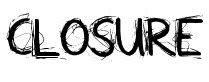
 I looked at these two types of typography as i thought they would give the title sequence a rough edge, and it would connote as if the investigator had written them himself through either anger or stress. I liked the idea of him writing the title sequences himself as it to connote that this is his story this is the closure that he needs for his life. This idea would work really well alongside the rest of the title sequence. But i wanted to carry on with the Chinese element to the title sequence so i went back on to Da font and looked at some more font types.


 There was a particular font style on Da font that was called Chinese/Japanese style writing, so i chose that particular font and found these ten fonts. There are certain ones that i am more drawn to than others, but i shall show the group all of these fonts during the week and hopefully we might choose one of them. I thought this style of writing would be best fitting for the title sequence as the triad theme is already very apparent throughout our title sequence. As a group we decided against using a type writing style typography as we feel it would not fit in with our title sequence anymore hopefully this one will be more best fitting.
No comments:
Post a Comment